Color Contrast Checker
Check WCAG 2.1 AA and AAA color contrast ratios for text and UI components, with live preview and accessible color suggestions
Interactive tool
Foreground
Background
What is a WCAG Color Contrast Checker?
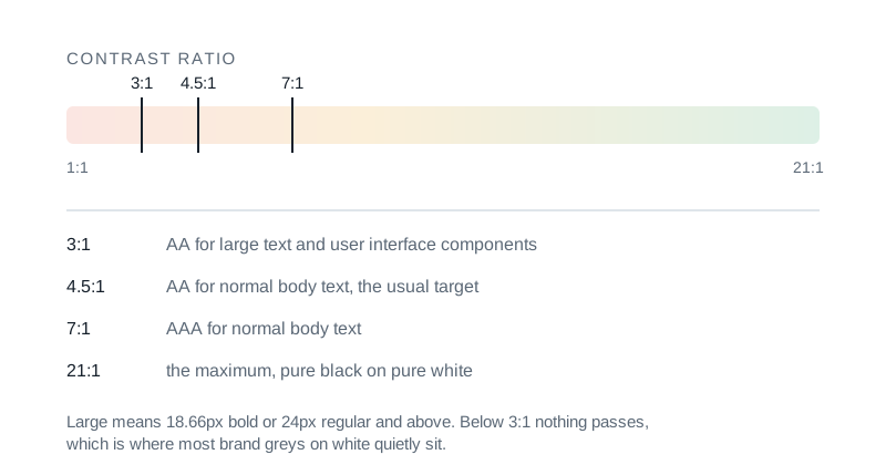
A WCAG color contrast checker compares two colors and computes the ratio between their relative luminance values. The Web Content Accessibility Guidelines (WCAG 2.1) define minimum contrast thresholds for normal text, large text, and UI components, designed so people with low vision can read and operate web content. This tool checks every threshold at once and proposes adjusted colors when your pair falls short.
How to Use This Contrast Checker
- 1Pick a foreground color (your text or UI element)
- 2Pick a background color
- 3Read the contrast ratio and the live AA/AAA badges
- 4Use the swap button to flip foreground and background
- 5Apply a suggested color when your pair fails AA
- 6Copy the summary or take a screenshot of the preview
Key features
WCAG 2.1 thresholds
AA, AAA, normal, large, and UI/non-text checks in a single panel
Live preview
See sample text and a UI button rendered with your exact colors
AA fix suggestions
When a pair fails, the tool proposes nearby colors that pass AA
Multiple input formats
Accepts HEX, RGB, HSL, and named CSS colors
Color picker + manual entry
Use the native color picker or paste a value from your design tokens
Swap button
Flip foreground and background to test both directions
One-click apply
Apply a suggested color directly without copying it manually
100% private
Everything runs locally; no analytics or design assets are uploaded
Why Test Color Contrast?
Insufficient contrast is the most common accessibility failure on the web, and it affects a wide audience: people with low vision, older readers, anyone using a glare-prone laptop screen outdoors. Meeting WCAG AA contrast is also required by many regulations (ADA in the US, EAA in the EU, AODA in Canada). Beyond compliance, accessible color choices improve readability and reduce eye fatigue for everyone.
Common use cases
- Auditing a design system's text-on-background combinations
- Validating a brand color palette before rolling it out
- Choosing accessible button hover states
- Picking error and success colors that work on light and dark themes
- Verifying chart and dashboard color choices
- Documenting accessibility decisions for compliance reports
WCAG thresholds at a glance
- AA Normal text: ≥ 4.5:1
- AAA Normal text: ≥ 7:1
- AA Large text (18pt or 14pt bold): ≥ 3:1
- AAA Large text: ≥ 4.5:1
- UI components and graphical objects: ≥ 3:1
- Logos and incidental text are exempt from contrast rules
WCAG 2.x vs APCA
WCAG 2.x uses a luminance-ratio formula that has known shortcomings, especially for very dark or very saturated colors. APCA (the Accessible Perceptual Contrast Algorithm) is the proposed replacement under WCAG 3 but is not yet a normative standard. This tool implements the WCAG 2.1 algorithm because it is what most regulations and CI checks still measure.
Tips & best practices
Test in both directions
Some palettes pass for light text on a dark background but fail in reverse. Use the swap button to validate both modes at once.
Watch out for hover and disabled states
A button that passes AA in its default state often fails on hover or when disabled. Test those variants explicitly.
Don't forget non-text contrast
Form field borders, focus rings, icons, and chart strokes must reach 3:1 against their adjacent colors. The UI/Non-text badge covers this case.
Define large-text rules in your design system
Document the 18pt / 14pt bold threshold in your typography tokens so designers and engineers apply the rule consistently.
Avoid relying on color alone
Even with high contrast, never use color as the only signal: pair it with text, an icon, or a pattern so colorblind users get the same information.
Privacy & security
This contrast checker runs entirely in your browser. The colors you test are never uploaded, logged, or shared with any third party. The tool itself was built to pass WCAG AA against its own backgrounds.
Related tools
- QR Code Generator
Create QR codes for URLs, text, and more. Customize size and colors. Download PNG.
Utilities
- Unit Converter
Convert length, mass, temperature, volume, area, data storage, and speed using convert-units. locally in your browser.
Utilities
- Color Picker & Converter
Convert HEX, RGB, HSL, and CMYK. Check WCAG contrast between two colors.
Utilities
- Percentage Calculator
Calculate percentages with seven modes: percent of, what percent of, increase/decrease, add/subtract percent, and percent difference
Utilities
- PDF OCR / Make Searchable
Recognize text in scanned PDFs using Tesseract.js, then extract it as plain text or rebuild a searchable PDF with an invisible text layer. All client-side.
PDF Tools
- Video Frame Extractor
Extract still frames from any video as PNG or JPG: every N seconds, every N frames, at a single timestamp, or N evenly-spaced thumbnails. Runs entirely in your browser via ffmpeg.wasm. Downloads as a ZIP.
Video Tools
Frequently Asked Questions
What is the difference between WCAG AA and AAA?
WCAG AA is the legally recognized baseline accessibility standard; most regulations require it. AAA is a stricter level intended to maximize readability for people with significant low vision. AA Normal requires a 4.5:1 contrast ratio; AAA Normal requires 7:1.
What counts as "large text" under WCAG?
Large text is at least 18 point regular weight, or 14 point bold (roughly 24px and 18.66px in CSS). Large text only needs a 3:1 contrast ratio for AA, or 4.5:1 for AAA.
What is the 3:1 UI threshold for?
Non-text UI components: form field borders, icons, focus rings, and graphical objects, must reach a 3:1 contrast ratio against their adjacent colors to satisfy WCAG 2.1 success criterion 1.4.11.
Why does my dark color pair sometimes pass AA but look hard to read?
WCAG 2.x is known to over-rate contrast for very dark backgrounds. Treat the AA threshold as a floor, not a ceiling: use real users and the live preview to validate readability beyond the algorithm.
Are alpha-channel (semi-transparent) colors supported?
You can paste rgba/hsla values, but contrast against a transparent color is undefined unless you also know what is behind it. For accurate results, compose the color against the actual underlying surface first.
Is my data uploaded anywhere?
No. The contrast calculation happens entirely in your browser. Colors you test are never uploaded, logged, or shared.